The post 10 Questions With… Dustin Yellin appeared first on Interior Design.
]]>
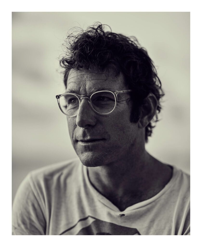
10 Questions With… Dustin Yellin
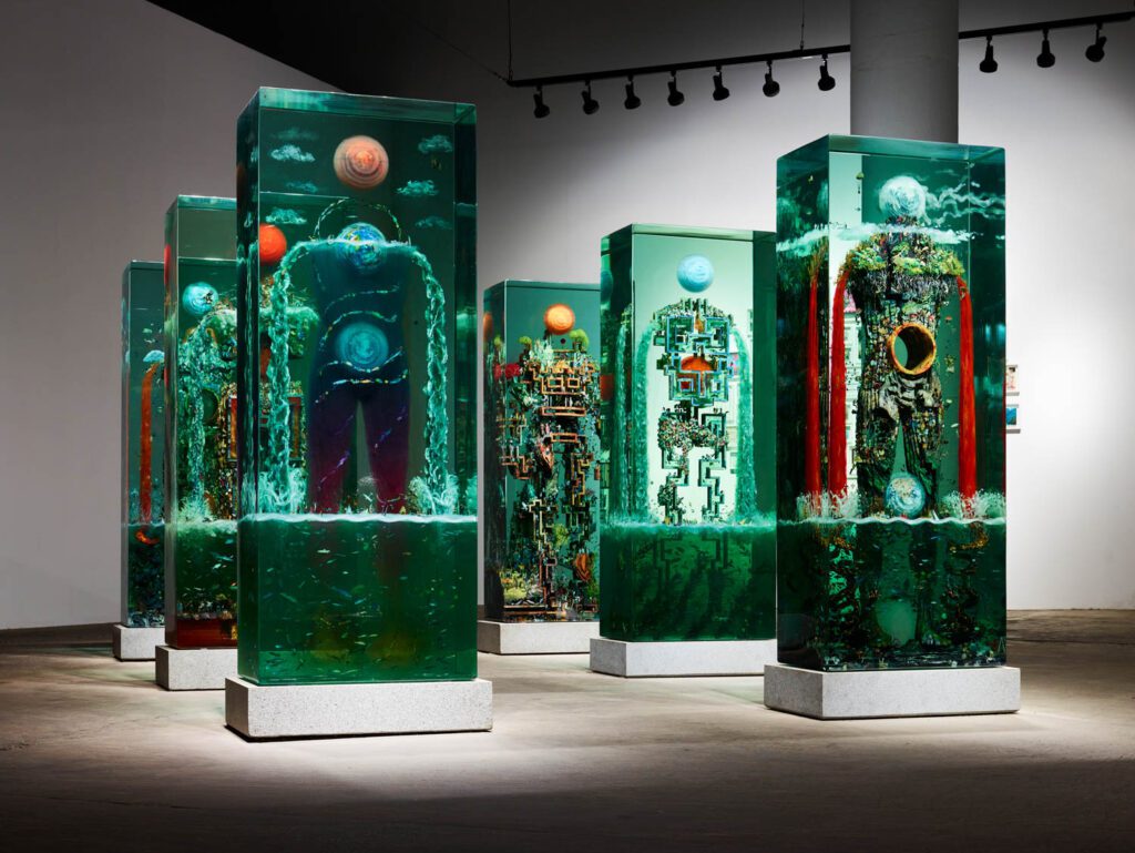
For some artists, a definitive relationship forms between their work and the neighborhood where it not only comes into fruition but blossoms. Such is the case with Dustin Yellin and the Red Hook area of Brooklyn. “The city is our great teacher, and it is for this reason that my door is always open to the street,” the artist tells Interior Design. “The threshold between the studio and the world is like a pore that expands with warmth and contracts in the cold—it is a reactive passage.” The serene Brooklyn neighborhood, which was once inhabited by fishermen, overlooks the intersection of downtown Manhattan and the Jersey shore and is now comprised of shipping yards and brownstone houses.
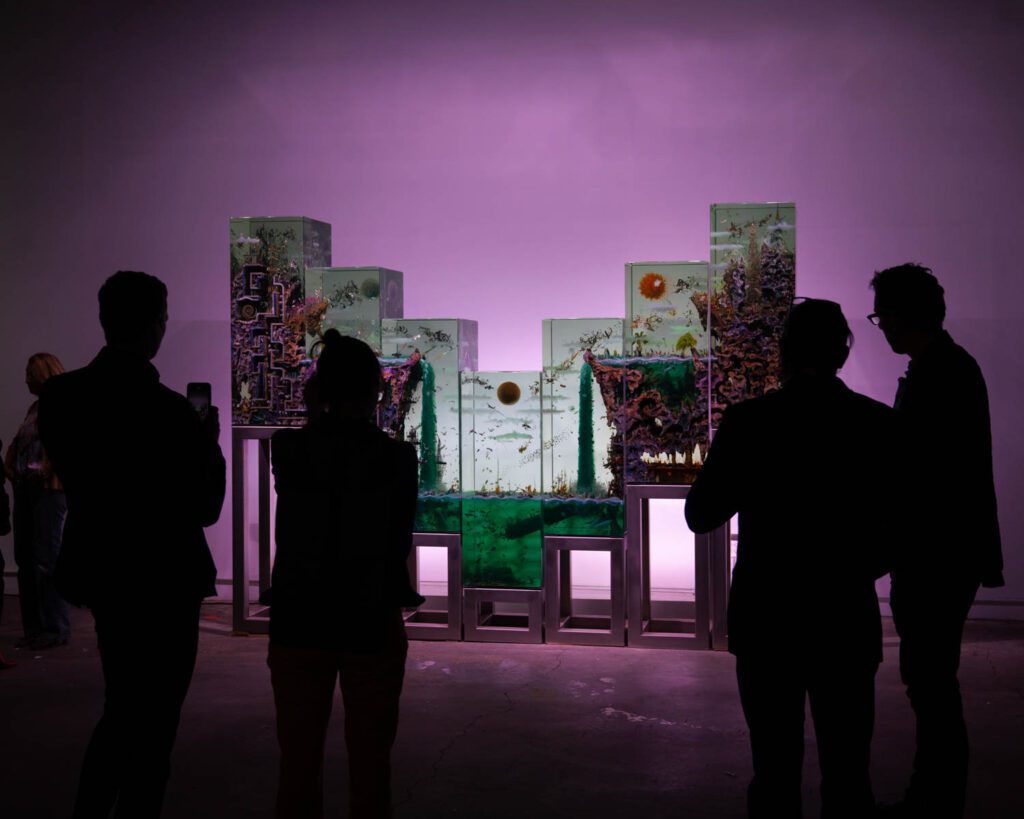
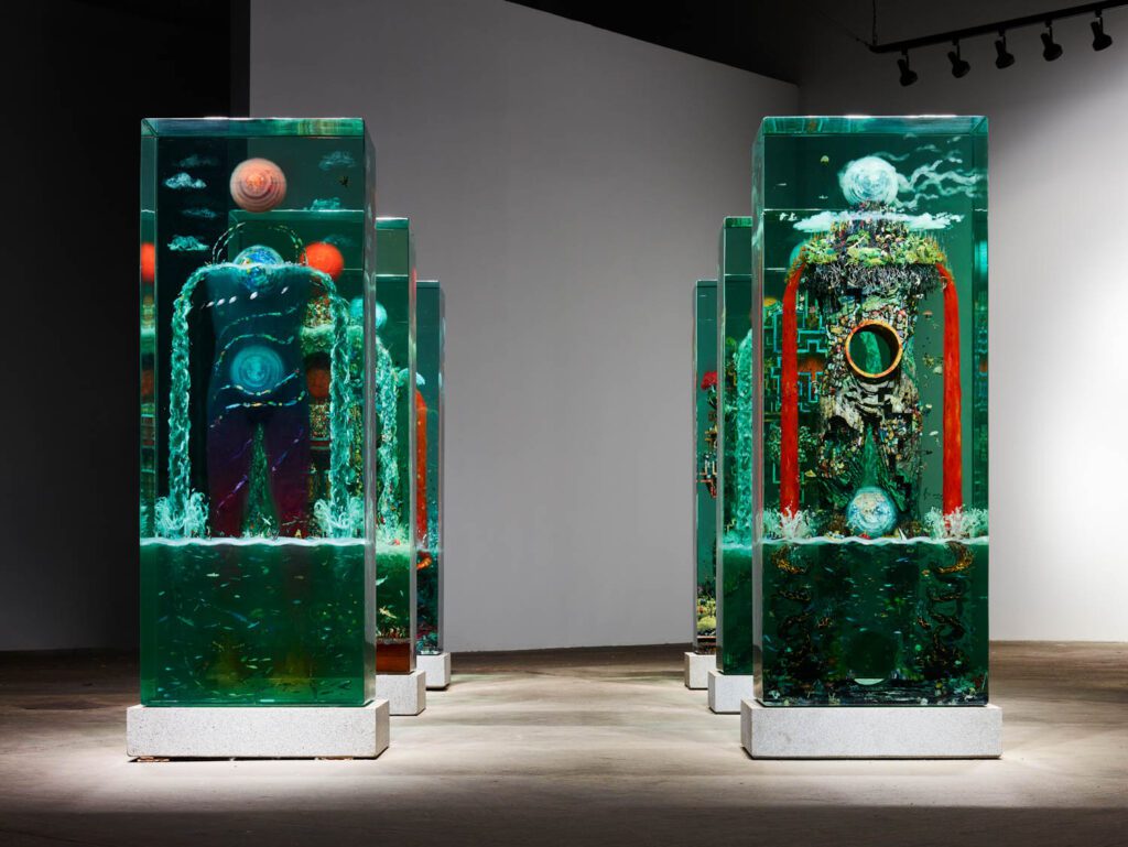
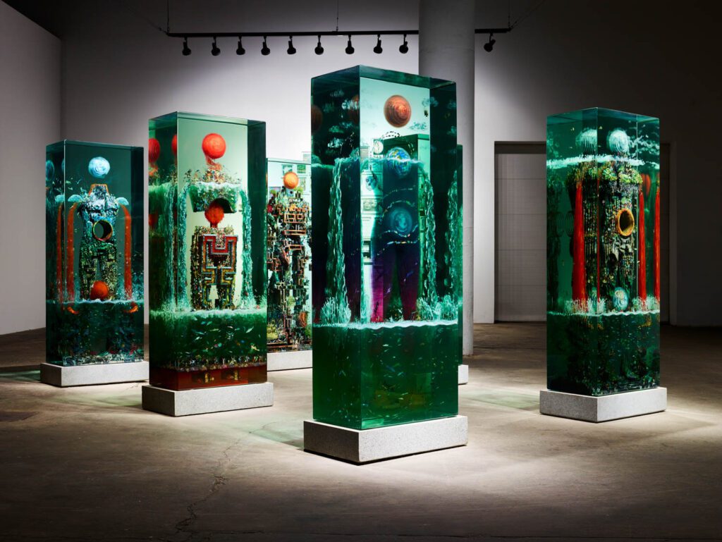
Yellin creates his glass sculptures, titled Psychogeographies, surrounded by the medley of natural and industrial vistas, merging intricacy of the hand with possibilities of technical advancements. Sandwiched between layers of vertical glass blocks as tall as six feet, the images invite viewers to move around moments frozen in time. Light plays an undeniable role in Yellin’s orchestration, creating an enthralling impact that bewilders the onlooker to linger and inspect the details.
Inside the studio—a warehouse he renovated down the street from his multidisciplinary art center Pioneer Works—Yellin relies on natural light as well as Ketra lighting by Lutron, merging the day’s fluctuating hues with shades he can tune and control. “Like a fly caught in amber, my works act as a kind of time capsule,” he says. “Instead of hosting fossils, I embed human artifacts, typically images sourced from print media, within in such a way that we, as a species, become the specimen.”
Read Interior Design’s interview with Yellin about finding the right light and the performative aspect of his sculptures.
Interior Design: The invention of the moving image owes much to lighting. What role does light play in your idea of “frozen cinema,” in other words suspending an image to stillness?
Dustin Yellin: Goethe once said that “architecture is frozen music.” My use of the term “frozen cinema” is an update to his idea that through pattern, plan, and frame, an artist can breathe narrative into fixed forms. Like architecture, and unlike cinema, sculpture requests the observer to experience art through a body in motion in space and time, which is never constant. In a sense, I employ two forms of scenography; one that is pictorial, while the other relies on an active viewer who becomes their own director scripting encounters with the work in real space and in real time. I find that the difference between stillness and animation is really just a matter of time.
ID: Could you talk about your relationship with glass as a form of craft and a conceptual medium?
DY: Glass is a paradoxical medium; it is both strong and fragile while it also attempts to show itself and hide at the same time. Duchamp once said something to the effect that the best art exhibits an ambiguity of experience that is not one thing or the other, but is both one thing, and something else at the same time. To answer in the negative, the only thing I am against conceptually in art is the dichotomy between either/or states of being.
ID: Light, whether natural or artificial, is critical in an artist’s life in studio, one that even determines the artist’s use of the space. What is your relationship with light from conception of a work to its final form?
DY: All vision is predicated on light, and yet we often take light for granted. Glass by its very nature does something extortionary to all forms of light: it bends it. And while painting reflects light, glass acts as both a prism and a filter that makes legible how photons move around the work and around us. As an analog, my glass works are more like sensors that allow each viewer, and myself, to build sensitivity to the nature of light itself.
ID: Why is midday sunlight your favorite?
DY: Midday’s lack of shadows chips away at the object-hood of glass, transforming it into something more akin to an instrument, whether that be a window, a mirror, or a prism.
ID: Light lives through a constant shift through movement, similar to your sculptures that invite viewers to rotate around them. How do you orchestrate this sense of mobility for your audience?
DY: My works have different edge conditions that each provide different ways and moments of seeing the work. As sculpture exists in four dimensions, the act of the observer moving around and through these different conditions allows a suit of shifting views that merge, develop, and emerge yet again out of these situations and their borders. This movement allows the work to always be in a state of “becoming.”
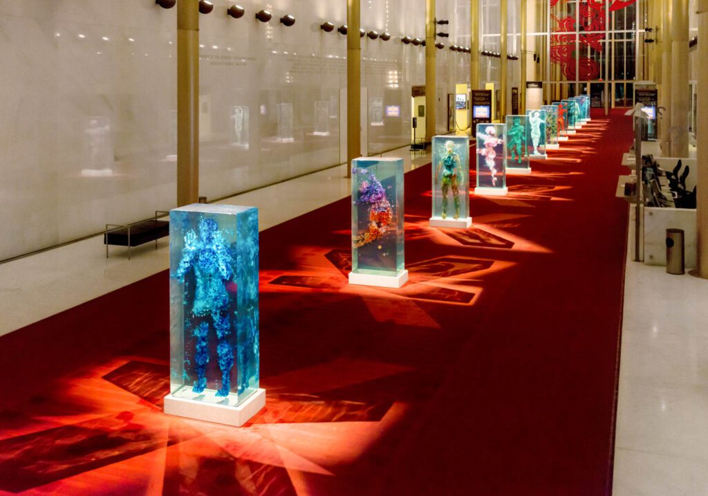
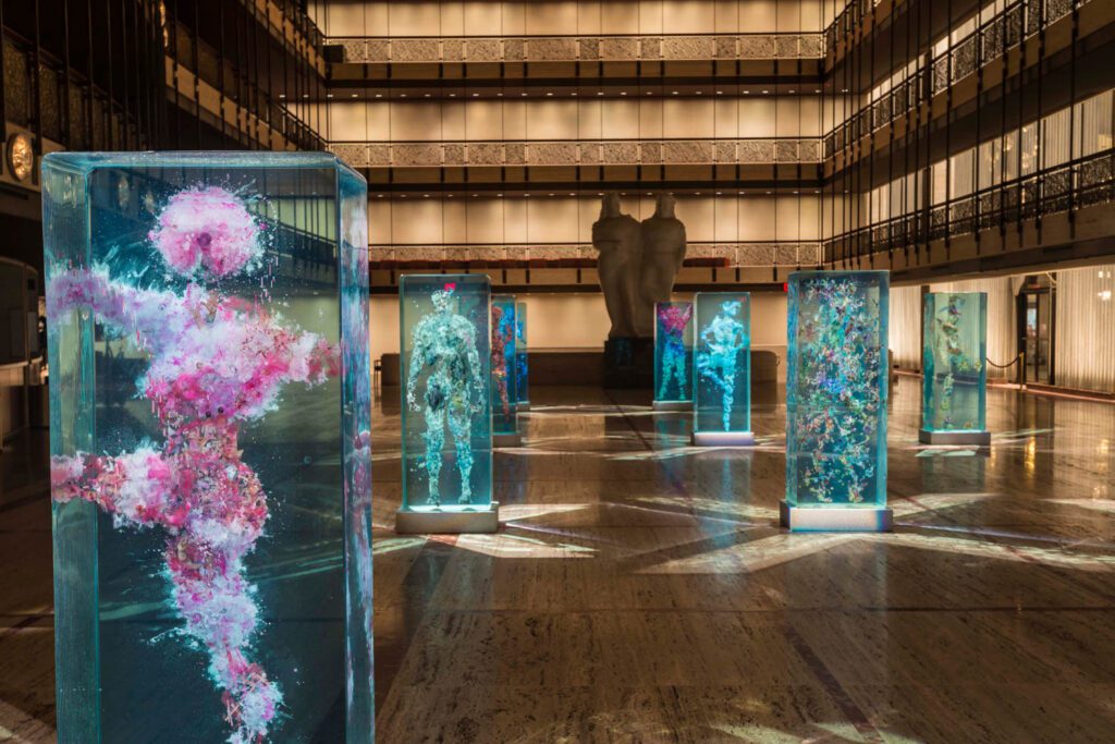
ID: Exhibiting Psychogeographies in spaces associated with dance creates an interesting contrast between movement and stillness. Could you talk about your projects for Lincoln Center in New York and the Kennedy Center in Washington, D.C. through this aspect?
DY: There is an adage that the rests between notes give music its soul. Movement and stillness are already wed, just as darkness is to light. Each defines and clarifies the other; without one there cannot be the other. Jung mentioned that the human condition is one of duality, and that art is the expression par excellence of this reality.
ID: Psychogeographies consists of paintings and sculptures. How do you see these play with dimensionality?
DY: Since the Renaissance, Western art developed a form of painterly perspective based on foreshortening and geometry. The Modernists countered this illusion by flatlining the picture plane to assert the flatness of the canvas. Instead of seeing these two modes as antithetical, I mix both together so that the shift between each technique produces a “3rd depth”. As my works are three dimensional objects comprised ostensibly of sets of layered picture plains, I also move along the z-axis through these plains to provide a further play of depth through the relation between classical perspective and scale in real space.
ID: Scale is another critical element, almost similar to miniature art in which minuscule elements build a narrative altogether. Can you share a bit about your process of using small bits to form larger narratives?
DY: Each work is a microcosm in which the individual parts never lose their own unique identity. They also work together as a community of images to produce a larger systemic image at the same time.
ID: You create work-on-paper studies of your sculptures but also use paper bits inside the works. Could you talk about your relationship with paper?
DY: Since the beginning of time, people have made marks to record their existence. These marks endure and circulate long after as a collection of shared experience. There are many words for this greater body of knowledge, be it consciousness or culture. In a sense, I feel that I tap into this long conversation by sourcing other people’s marks, and then reconfiguring these items with mark-making of my own. By preserving these histories in glass, I can sustain that long conversation.
ID: Pioneer Works is a space that proves the multimedia direction art-making has evolved into in recent years. Many artists and designers refuse categorization of their practices. How do you see the center’s impact on your work and vice versa?
DY: Pioneer Works is a “museum of process” in which we support the continual development of all disciplines and practices through experimentation and production. I feel that as we support others, we advance ourselves. Pioneer Works is my life practice; they are one and the same.
read more

DesignWire
Field Conforming Studio Creates a Sculptural Memorial to Home, Life, and Loss in China
Field Conforming Studio employs weathering steel for a sculptural memorial to home, life, and loss in central China.

DesignWire
Wyatt Kahn’s Mammoth Cor-Ten Sculptures Debut in Downtown Manhattan
“Wyatt Kahn: Life in the Abstract” represents the painter/sculptor’s first public-art exhibition and his first pieces in Cor-Ten steel.

DesignWire
Randi Renate Creates a Permanent Installation in Elizabethtown, New York
Inspired by the area’s High Peaks, Randi Renate creates a spherical permanent installation on the grounds of the Adirondack History Museum.
recent stories
DesignWire
Don’t Miss a Chance to Enter Interior Design’s Hall of Fame Red Carpet Contest
Interior Design and Swedish-based Bolon are teaming up to host a red carpet design competition for the Hall of Fame gala in New York.
DesignWire
Ukrainian Designers Speak Out on the Current State of Affairs
Following the Russian invasion, these Ukrainian designers tell Interior Design about the current reality of their work and home lives.

DesignWire
Chris Bogia’s Candle Sculpture Illuminates Fishers Island, New York
Candle, a sculptural installation by mixed-media artist Chris Bogia, is on display on New York’s Fishers Island.
The post 10 Questions With… Dustin Yellin appeared first on Interior Design.
]]>The post 10 Questions With… Chris Wolston appeared first on Interior Design.
]]>
10 Questions With… Chris Wolston
Wicker has entered Chris Wolston’s design vocabulary by way of terracotta, in the heart of Colombia’s vibrant industrial city, Medellín. The American artist and designer settled there in 2013 on a Fulbright scholarship to study pre-Colombian ceramics after graduating from Rhode Island School of Design. “My point of research was on living material cultures and dissecting their various historical connections,” he tells Interior Design.
Although Wolston’s design philosophy has remained partially the same, his window has expanded to include another beloved technique of the region, wicker. In 2018, Wolston was in search of a material to contrast the anodized aluminum exterior of a wardrobe and came along the idea to use rattan for the interior. “At the same time, I started making wicker chairs as softer contrasts to my heavy aluminum tables,” he remembers. Soon, he started working with a profit-sharing collective studio of 10 weavers started by a craftsperson. Since then, his wicker furniture and lighting fixtures in humanoid forms have taken Wolston across the globe, from Qatar’s membership-based hospitality club Culture Pass to collaborations with Fendi, Dior, and soon Dolce & Gabbana.
The Nalgonas, which reflect Wolston’s design lexicon, is a series of hefty rattan seats with limbs sprouting from their various corners. Playful and bodily, they poke at the notions of gender, performance, camp, and familiarity, all while breathing an alternative life to a material tightly connected to Colombia through agriculture and history.
While Wolston presents his work with The Future Perfect gallery through solo shows and fairs like Design Miami/ and Salone, he works from a Medellín studio in a century-old neighborhood with an eclectic architecture that mixes those heydays with modern buildings. Both inside his blue-painted workplace and out in a backyard, he collaborates with local artisans to create wicker furniture, as well as ceramics in a warehouse next door. “Mother Nature Pachamama is very present here,” he says about his life between the studio and a house up in the mountains. “There is a dynamic landscape between the city and the mountainside—we are in the city of eternal spring here.”
Interior Design: Wicker is a transatlantic material, with a history that spans Africa, Asia, Americas, and Europe. How does such a culturally-layered material inform your practice?
Chris Wolston: To think materials can connect us with various cultures and civilizations is fascinating, and this is true for archeological ceramics or woven basketry. Although woven baskets haven’t survived archeologically in the same way ceramics have, they always had a place and time in history. Materials and techniques shift a bit, but rattan and the wicker technique have existed in various parts of the world. Europe, for example, has a long history of wicker weaving with willow and different species of reed. Speaking this location and Colombia, wicker material comes from yare which is a natural vine harvested by indigenous communities .
I should note that the style of weaving that we use at the studio for furniture-making is just one of many. A lot of the furniture made with this material is basically sofas that go outdoors next to the pool, so aesthetically not everything is so perfected. Working with the master craftspeople is an interesting process because of the opportunity to push the technique to more developed aesthetic directions and create an alternative to what is largely available.
ID: How is your relationship with this material in terms of a learning process? Given its history and potential in use, is this an unending education?
CW: My practice has actually developed out of this very reason, through a personal exploration of the material with new techniques. As a foreigner living here, for instance, this has also been an exploration of the place. There are so many different ways to work with materials, and part of my practice is really based around exploration, even maybe obsessively. This could be about how to use the aluminum in a in a new way or push wicker to new directions.
ID: How does your collaboration with local artisans and craftspeople guide this journey?
CW: Medellín is interesting because we have the studio where we create the majority of the work, and a lot of that work involves artisans from small scale studios nearby. For example, the aluminum foundry I work with is just down the street or the polisher is around the corner. This proximity to material mastery in a localized area is fascinating, especially if we are talking about learning further on materials and develop ideas around them. I’d call here a material paradise. In a city like New York, resources are probably within the tri-state area but actually gaining access to people and materials is pretty impossible. Here, we are in a seamless flow.
ID: Let’s talk about the humanoid element of your chairs and light fixtures. There is a boldness in your direct reference to the body. How did you develop this signature silhouette?
CW: I was working at the aluminum foundry for the tables, and I became interested in how fleshy the surface of thin cast aluminum looked. I created a series of tables that had different humanoid forms as a way to bring out that element of materiality. As someone whose studio practice is developed out of research, I am obsessed about how materials are applied in these industrial scenarios and figuring out new ways of applying those techniques. I’ve always been interested in furniture as sort of a media. Because it’s relational and so unpretentious, everybody has a certain level of intimacy with their furniture, or they’re able to interact with them in a way that is natural. For me, creating furniture is similar to making relational sculptures. One of the elements think often is this human relationship with materials. It is funny that the chairs have emerged as these very human forms that embrace the sitters. My intention in applying this materiality to the forms was also to create something tactile that calls for a physical connection.
ID: There is an element of surreality in your rendition of limbs in various forms, hugging or zigzagging. Could you talk about your interest in Surrealism and Dalí?
CW: Before I put together my last collection, I had visited the Dalí Museum and the Miro Foundation, in Barcelona. I think that humor and abstraction can be an entry point for people to have a better connection with the materiality, so a lot of my work has an element of humor. That allows people to connect with the work and their material and have a more personal experience.
ID: How about the furniture’s genderless-ness? The objects are bodies without distinct markers of any sex or gender.
CW: Everybody is into what they’re into. I see Nalgona chairs as [masculine] but other people will refer to them in other genders that aren’t at the forefront of my mind, and I think that’s great. The idea is that the furniture lets people have an entry point to have their own experience. This shows the variation in perspective. Living between New York and Medellín, the variation in perspectives is very clear, and I find it important to acknowledge that we all do have different perspectives on the body and its expressions.
ID: Could you talk about the invitation for performance? A chair with limbs prompts the sitter to engage with furniture in ways that are beyond the typical ritual of using a seat—the user’s body must react to the body referenced in the chair.
CW: The work is an exploration into cultural context. But instead of presenting it in a really formal way, I find humorous presentations which I think is actually more unpretentious and accessible to all.
ID: You also achieve this access with the photography and activate furniture with models.
CW: I work with photographer David Sierra who is a fashion photographer. A lot of the time, the pieces are photographed in a fashion-oriented way or we have even done short films. Furniture in some ways has similarities to fashion: they are materials that humans interact with. Therefore, I am interested in showing how models interact with the forms with a nod to high fashion. This way, there is a story beyond just the object itself—a narrative. David is such an incredible photographer who gives a dimensionality to the furniture. Here in the studio, there are so many stories, different people, and various processes that it’s nice to create a story and context for that work. The photography is not necessarily telling the story of the making, but create a narrative that the pieces can live in.

ID: Craft has been a primary tool for queer artists and designers for challenging the status quo on valuation of labor, questioning the hierarchies of making, and emphasizing the process over the finished material. How do you see this social side of being engaged with craft today?
CW: Craft is egalitarian—especially as we previously talked about the unpretentious and accessible nature of the work. Looking at ancient traditions in Southeast Asia, Europe, or the Middle East, these materials and techniques have been used throughout humanity. Clay, weaving traditions, stone, or wood carving—for all, craft is the universal mastery of the technique without added interpretation of a concept, ego or other elements. On a pure level, craft is human interaction with materials. Looking at gender and identity, as well as the exploration of new frontiers within these genres, craft is a really interesting entry point because it doesn’t necessarily have a definitive set of rules. Rather, it is more about exploration and discovery.
ID: Has your recent tapestry work at New York’s Emma Scully Gallery come out of a similar experimentation with the material? Have you been in search of new directions and textures?
CW: The two carpets in Anti Chairs are parts of a larger series, which are based on abstract oil pastel drawings I created with inspiration from the native bird species in my garden—think of tropical birds in bright colors. This was a personal exploration of abstractionist aesthetic, and later, I worked with a team in Chimichagua which is a town famous for its grass carpets. I had been interested in this weaving technique for some time, so I gave different weaving studios in this town the same drawing, with specifications on the dimension and the dyes but left interpretations of the drawing to the each weaver. When the carpets came back, the results were fascinatingly different although there was still a clear similarity within them. This was an exploration of subjectivity and objectivity in weaving and the role of the personal perspective.
read more

DesignWire
14 Young Designer Highlights from the SaloneSatellite in Milan
Last week, SaloneSatellite, Salone del Mobile’s celebration of rising stars under 35 returned with a focus on sustainability.

DesignWire
Design Miami/ 2021 Spotlights Socially Conscious Designs
While Art Basel Miami Beach anchored Miami’s boasting week of art, design and fashion last week, Design Miami/, right across the street at the Pride Park, determined the busy calendar’s design trajectory. With the re…

DesignWire
10 Questions With… Superhouse Founder Stephen Markos
Interior Design caught up with Superhouse founder Stephen Markos, who is creating a platform to present queer design.
recent stories
DesignWire
Don’t Miss a Chance to Enter Interior Design’s Hall of Fame Red Carpet Contest
Interior Design and Swedish-based Bolon are teaming up to host a red carpet design competition for the Hall of Fame gala in New York.
DesignWire
Ukrainian Designers Speak Out on the Current State of Affairs
Following the Russian invasion, these Ukrainian designers tell Interior Design about the current reality of their work and home lives.

DesignWire
10 Questions With… Dustin Yellin
Artist Dustin Yellin chats with Interior Design about finding the right light and the performative aspect of his sculptures.
The post 10 Questions With… Chris Wolston appeared first on Interior Design.
]]>The post New Zealand’s Fresh, Contemporary Design Scene Takes the Spotlight appeared first on Interior Design.
]]>
New Zealand’s Fresh, Contemporary Design Scene Takes the Spotlight
Want to take a gander at a design market that hasn’t yet over-saturated Instagram feeds? Fresh from the antipodes, it’s the New Zealand Design Pavilion, open to the trade and public now until July 1 in Shack 15 at San Francisco’s iconic Ferry Building.
Six Kiwi manufacturers—Resident, Citta, James Dunlop Textiles, David Trubridge, Noho, and Nodi—have banded together to showcase an assortment of their furniture, lighting, flooring, and textiles. Together, the wares highlight the nation’s unique perspective: clean of line with a focus on natural materials, not dissimilar to Japanese and Scandinavian design but with a marked casual, laid-back effortlessness.
The New Zealand Design Pavilion marks the first independent exhibition of foreign homeware design in the country since the pandemic scuppered travel, and the most comprehensive showing of New Zealand design in the U.S. in modern history. Designed in partnership with creative agency Aditions, the 7,500-square-foot exhibition references common elements that are a through-line through much of New Zealand’s design ouput, whether it be the architecture of Fearon Hay or the modernism of the late Maori architect Rewi Thompson.
The importance of the natural world and protecting that through sustainable design shines through as does love for the sensory qualities of the country’s coastal, forest, and alpine landscapes. New Zealand’s daylight is inimitably bright, standing in stark contrast to Europe and North America’s warmer glow (maybe blame the nearby hole in the ozone layer?). That light picks out detail with such clarity that any over-the-top embellishments or maximalist frenzy tends to look garish. (“I remember taking fabric samples back from overseas and they looked completely different, far too saturated!” recalls Mokum design director Stephanie Moffitt of the phenomenon.) That perhaps goes some way to explaining the natural drive of New Zealand design with its focus on elemental materials such as wood and concrete and its often sober details. It’s an aesthetic that translates with alacrity, however. “We all have much more in common than we think, and so this New Zealand Design Pavilion represents the power of our collective lens on the world,” says Resident co-founder Scott Bridgens. “The light is different down here, and through this initiative we aim to illuminate our creativity and ingenuity, and most importantly, share it with others.”
read more

DesignWire
In a Former Necchi Factory, Baranzate Ateliers is Milan Design Week’s Hottest New Show
Milan Design Week always promises something new and fantastic—and the 21 creators featured in “Baranzate Ateliers” stole the show for 2022.

DesignWire
15 Highlights from the Africa Edition of Révélations 2022
See highlights from the Africa edition of Révélations 2022, the international craft show that opens in Paris June 9.

DesignWire
Highlights from the 60th Edition of The Philadelphia Show
See the highlights from the 60th edition of the Philadelphia Show featuring classical European furniture to contemporary art.
recent stories
DesignWire
Don’t Miss a Chance to Enter Interior Design’s Hall of Fame Red Carpet Contest
Interior Design and Swedish-based Bolon are teaming up to host a red carpet design competition for the Hall of Fame gala in New York.
DesignWire
Ukrainian Designers Speak Out on the Current State of Affairs
Following the Russian invasion, these Ukrainian designers tell Interior Design about the current reality of their work and home lives.
DesignWire
10 Questions With… Dustin Yellin
Artist Dustin Yellin chats with Interior Design about finding the right light and the performative aspect of his sculptures.
The post New Zealand’s Fresh, Contemporary Design Scene Takes the Spotlight appeared first on Interior Design.
]]>The post ProductLIVE: LightArt appeared first on Interior Design.
]]>The post 10 Questions With… In Common With appeared first on Interior Design.
]]>
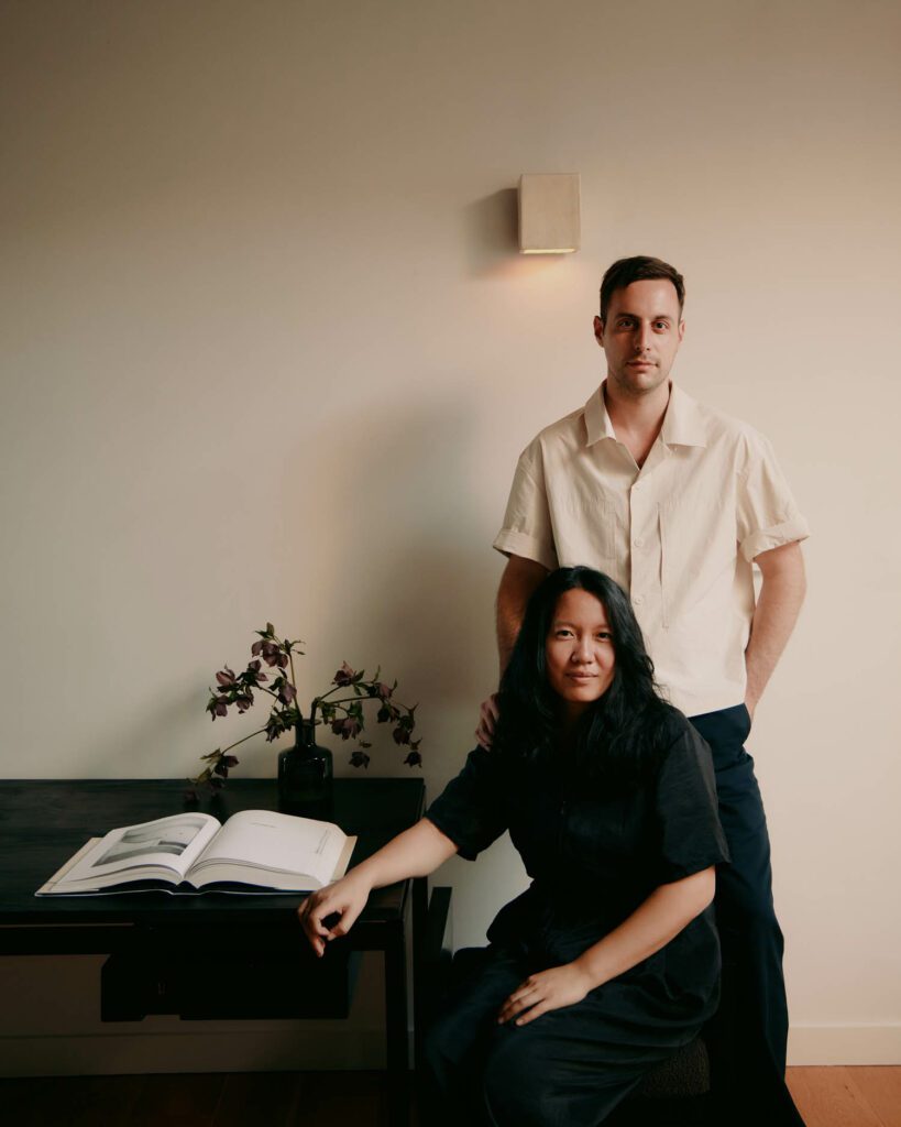
10 Questions With… In Common With
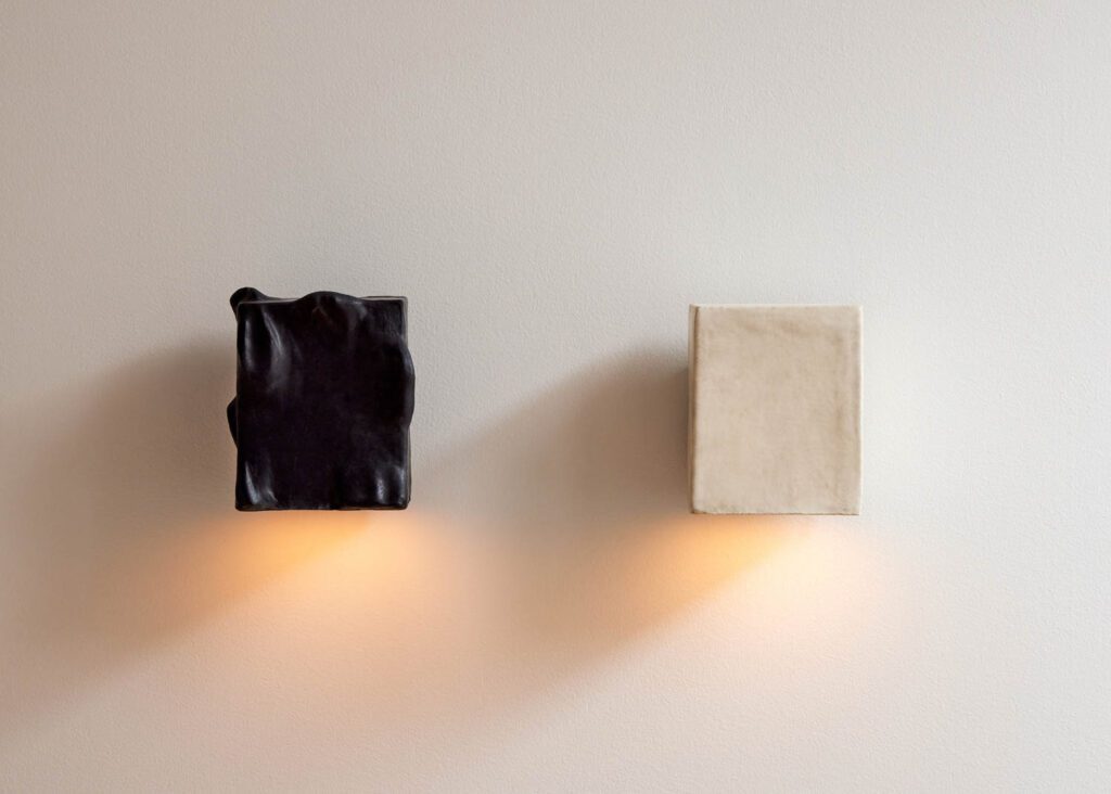
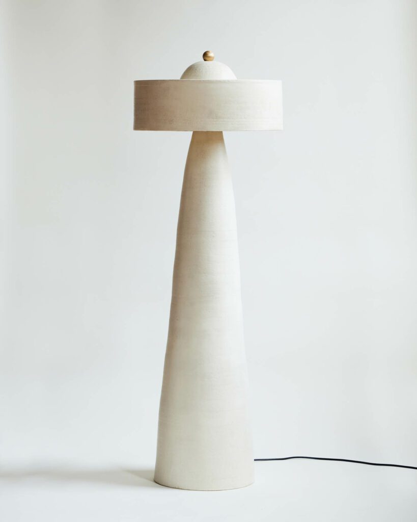
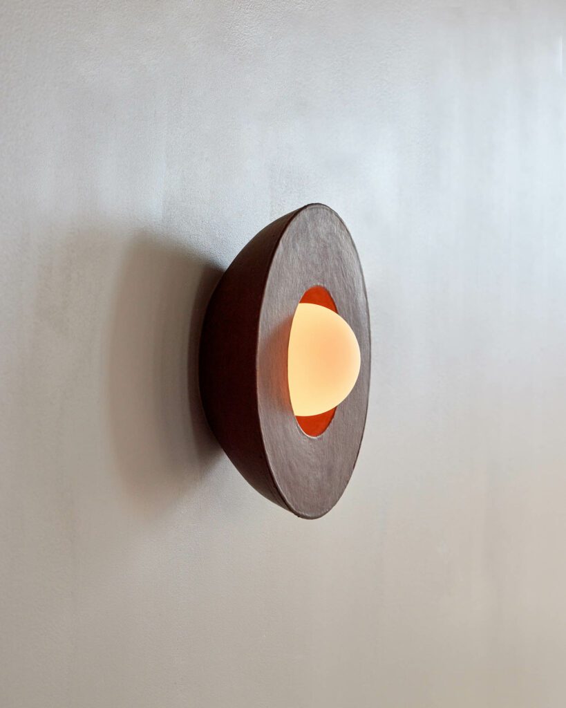
The duo behind Brooklyn-based lighting studio In Common With call each other “design soul mates,” and like any symbiotic relationship, they think the strength of their bond comes from “not doing necessarily the same things but complimenting each others works.” The fixtures, made by studio founders Nick Ozemba and Felicia Hung, reflect this duality, not only through their serene balance and material-first sculptural qualities but also through occasional collaborations.
Terra Series, their eight-piece second collaboration with ceramic artist and designer Danny Kaplan is a vivid example of effortless creative unity. The trio’s first attempts together, which started out as an Instagram crush, centered around taking their designs and smashing them together, ultimately creating monochromatic lighting objects in 2020. In Common With describes this process as “less about dissimilarities” and more about drawing on various ideas to “create a new language.”
Ozemba and Hung’s paths crossed at RISD where they first talked about collaborating. “We balance each other out and build on our work together,” they say, “which explains why we feel comfortable bringing in a third voice.” Their new line with Kaplan, which they recently launched at th Brooklyn design shop, Assembly Line, merges the immediate tactility of hand-thrown ceramic with the duo’s minimalist approach to the form and function of lighting. The interplay between clay and light yields both sculptural and utilitarian potentials, pushing their practices to new lengths.
Interior Design: Could you talk about the sculptural potential of light fixtures? Do you think about the idea that when turned off, light fixtures gain sculpture qualities?
In Common With: In fact, we think about this aspect often. What do light fixtures become when they’re off? The pieces we’ve made with Danny do live in that type of way. A lot of them have artwork qualities but they function as lights too. The new floor lamp, for example, holds so much presence in a room—it’s 5 feet tall whether it’s lit or not. We live with light fixtures but the majority of the time, they are not on, so this is a very important component of our thinking.
ID: The name In Common With references to a partnership but also a duality. Does the name represent your dynamic as well as your work with others?
ICW: Collaboration was very important to us when we first decided to start this company, whether it’s with another designer artist, like Danny Kaplan, or with the interior designers, architects or anyone looking to buy a light fixture. Our whole ethos is to work with other people. We have our own design opinions, but the experience has been so much more when we add another opinion into the process.
ID: What are some of the rewards and challenges of collaborations?
ICW: Like any relationship, there are parts that are always amazing and those that are a struggle. The real element is being able to find the balance to come together and push all of our boundaries for something new. With Danny, for example, we work so well together because we’re able to see where everyone is at, and with the new collection, we’ve taken this to a new level. The objects look unlike any work any of us has made before, in ways that neither one of us or Danny probably would have done. This also applies to manufacturers we work with or the interior designers who we do special projects with for new ideas. Working with someone else comes with new constraints that push us to do things we just normally wouldn’t do. The challenge is to do the situation that pushes you to think in a different way.
ID: When washed with light, the materials gain new looks and textures. What is the role of materials in designing light objects?
ICW: Our backgrounds are both in furniture design, but our training is all material driven, and that interaction is really where our ideas start and stop. Even with the ceramic pieces, we push the boundaries of the material to make something more interesting than they are. From a perspective of light as well we think about how they’re going to be used and what type of light we want it to be. With Danny, the table and floor lamps are down lights for reading but the pendants give off an ambient glow. Light is something we always keep in the back of our minds, but we are always seeing what the material wants to let the light become and then use that as an inspiration.
With the ceramic material, the negative space between the light and the material is important—we keep in mind the idea of creating these interesting negative spaces within the fixture.
ID: Are there specific visual reactions you look for in materials in terms of their interactions with light?
ICW: We look into what the material wants to do and where we can push it to do so. With our glass collections, we’ve pushed the ways glass can be blown. In the same way, we have also pushed the colors we could use so they interact with the light in interesting ways. The ceramic works with Danny have really been driven by the material and the attention to how detailed the artistry could be.
ID: Ceramic has been gaining popularity both in fine art and design. How do you see this rise parallel to the escalated need for touch in reaction to technology’s impact on design?
ICW: Ceramic is probably one of the entryways to what people consider a very manual practice but we think about this moment beyond ceramic too. We have for example taken ceramics classes to test with the material. We are both very hands-on with the way that we learn and we prefer being able to physically do something instead of watching it on a computer. Our glass is also completely handmade, which can be a scarier skill to have. More than a trend, for us, the handmade is a timeless part of how we think about design and what it will be like moving forward.
ID: What prompted you to go towards a geometric form in your second iteration with Kaplan?
ICW: There’s one piece from the first collection, the Augustus, which has a flat bottom to it. We came up with that together, it was not something that Danny had ever done in his work before and it was one of the parts we thought was the strongest and most interesting. So we wanted to play up the flat planar geometry with some of the like organic pieces still in the collection, too. The simple geometry, I think, is what is most similar to a lot of our work outside of our collaboration with Danny. So I think a lot of it feels it’s right in the middle of where we’ve come together. A lot of the surface mounts and pendants… have that flat surface on the bottom, which are really unique and not present in a lot of other ceramic pieces. It feels really unique to us and different from all of our work.
ID: As light design continues to evolve in the wake of the pandemic, how has it prompted an interest and demand in design objects?
ICW: We started our company at the right time in 2018. Then we were more focused on hospitality, hotels and restaurants but with the pandemic, we saw a lot more people buying objects for their homes. This reality has somehow allowed us to hire more people and build the brand. Collecting has been embedded in European culture for a long time, and we’re just starting to see that in the U.S., people are invested in acquiring pieces that have the potential to become family heirlooms. This shift is also happening in the general culture, such as fashion. The pandemic however has expedited it for our industry, and we don’t think it will go away.
ID: Light fixtures are part of product design but they affect the overall interior. When lit, they impact the furniture, wallpaper, drapery, and the overall architecture. What do you think about this omnipresence?
ICW: After studying furniture, our intention was always to do both furniture and other things. The reason why we started off with lighting and has stuck with it for so long has been about how much it affects a space. Light is one of the easiest ways to change your space. You can just switch out the lights in your room and this will just make a big difference. Light has a much greater impact on our moods than a piece like a table or chair.

ID: Terra collection has an earthy color palette. How was your decision making process about the colors in a collaborative way?
ICW: Our first collaboration in 2020 was all in black and white, and now we have three new colors. We gravitate towards natural tones because they they fit everywhere and stay timeless. Think about a Noguchi lamp in a cream color—it will fit into any interior for the rest of time. I think that that’s what we think about when we’re choosing colors, too, is where’s this going to be? And like? How is it going to stand the test of time?
read more

DesignWire
Design Duo HAOS Commits to Rules of the Film Movement Dogme 95
HAOS’ new furniture pieces, which stem from their application of the film manifesto Dogme 95 into design, are on view at Love House.

Products
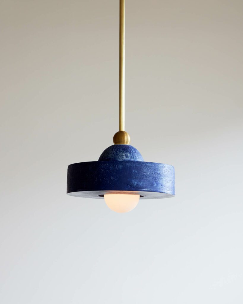
In Common With Collaborates With Skilled Artisans for Terra Lighting Collection
“When you see one of our objects, you’re seeing several invisible hands,” says Nick Ozemba, who runs his Brooklyn studio In Common With alongside co-founder Felicia Hung under the credence that collabor…

Products
Edward Barber and Jay Osgerby Create Limited-Edition Lighting for First Solo Exhibition
Check out the limited-edition lighting by Edward Barber and Jay Osgerby for “Signals,” their first solo exhibition with Galerie kreo.
recent stories
DesignWire
Don’t Miss a Chance to Enter Interior Design’s Hall of Fame Red Carpet Contest
Interior Design and Swedish-based Bolon are teaming up to host a red carpet design competition for the Hall of Fame gala in New York.
DesignWire
Ukrainian Designers Speak Out on the Current State of Affairs
Following the Russian invasion, these Ukrainian designers tell Interior Design about the current reality of their work and home lives.
DesignWire
10 Questions With… Dustin Yellin
Artist Dustin Yellin chats with Interior Design about finding the right light and the performative aspect of his sculptures.
The post 10 Questions With… In Common With appeared first on Interior Design.
]]>The post Hall of Fame: Ingo Maurer appeared first on Interior Design.
]]>The collection includes lighting, wall decor, and decorative accessory designs categorized into four groups—Bend, Cut, Glaze and Roll—inspired by traditional acts of making. The collection’s minimalist sconces, pendants, linear chandeliers, mirrors, and accessories were designed for a myriad of residential, hospitality, and commercial applications, with endless installation possibilities and opportunities to combine, multiply, and customize installations in spaces of every size and style.
The post Arteriors x Workshop/APD Collaboration appeared first on Interior Design.
]]>